Store pages · 6 min read
App Store vs Google Play: 6 differences that change how you write your store page.
Most teams write one store listing and paste it into both stores. That leaves search and conversion on the table, because Apple and Google read, show and test your page in different ways.
 Kai Bergquelle
Founder, GrowthLaunch

1. Google reads your description. Apple doesn't.
On Google Play, the full description (up to 4,000 characters) is used for search. Write it for people first, but use the words they search for naturally and early.
On the App Store, the description is not used for search ranking. It only has to persuade. Keep it short, lead with the main benefit, and put your search terms somewhere else.
2. Apple gives you a hidden keyword field
The App Store has a 100-character keyword field that users never see. Separate words with commas, skip spaces, and don't repeat words already in your app name or subtitle. Apple combines them for you.
Google Play has no keyword field. Your title, short description and full description do that job.
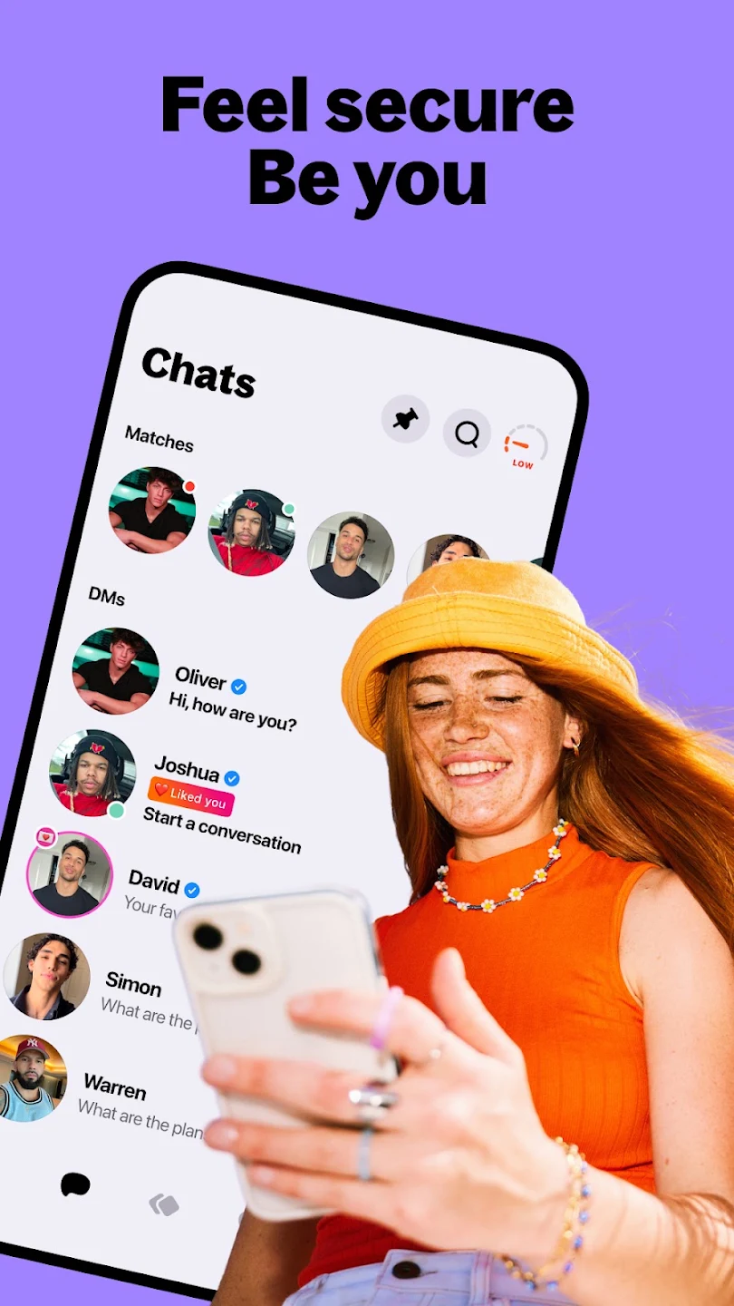
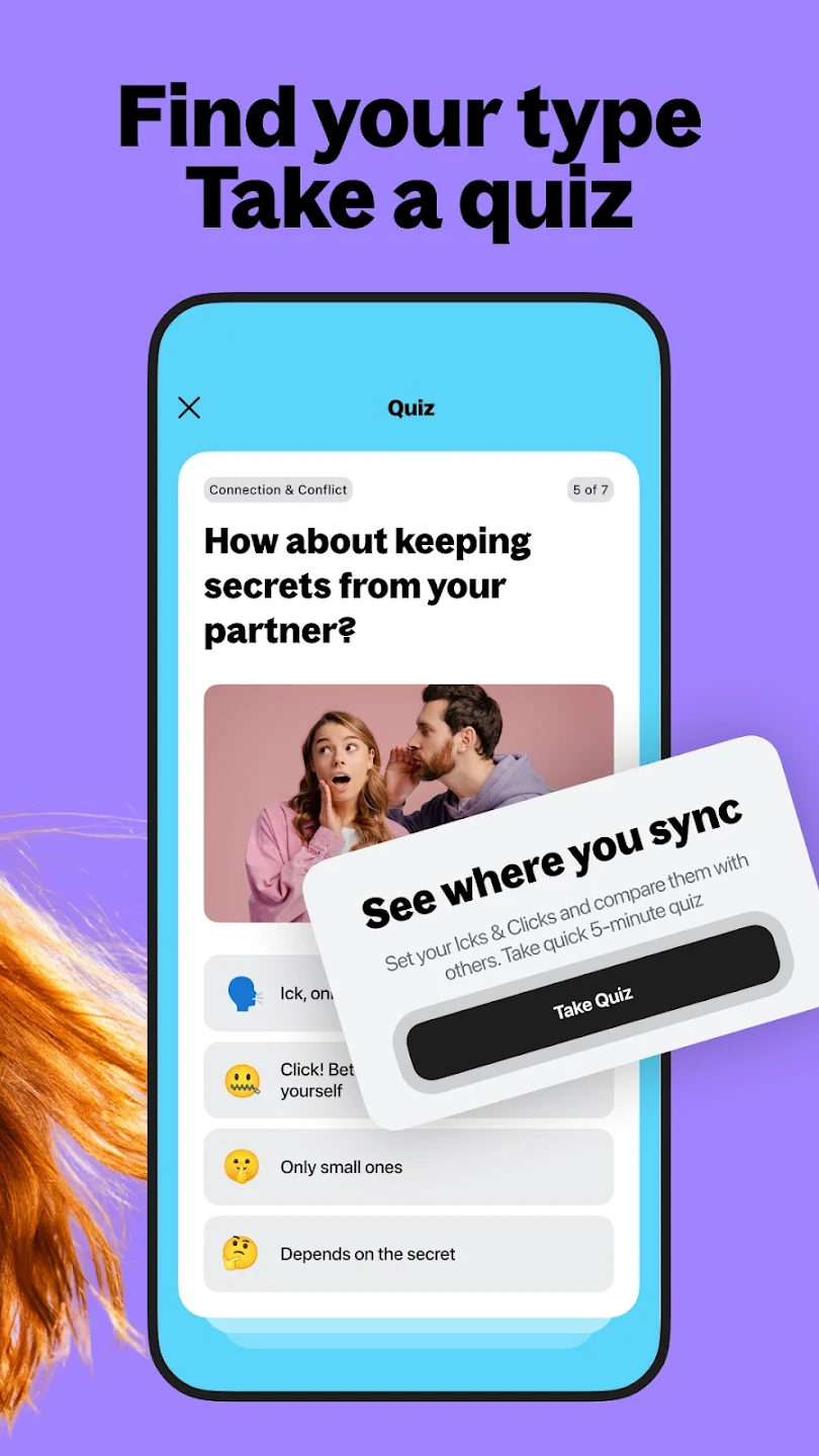
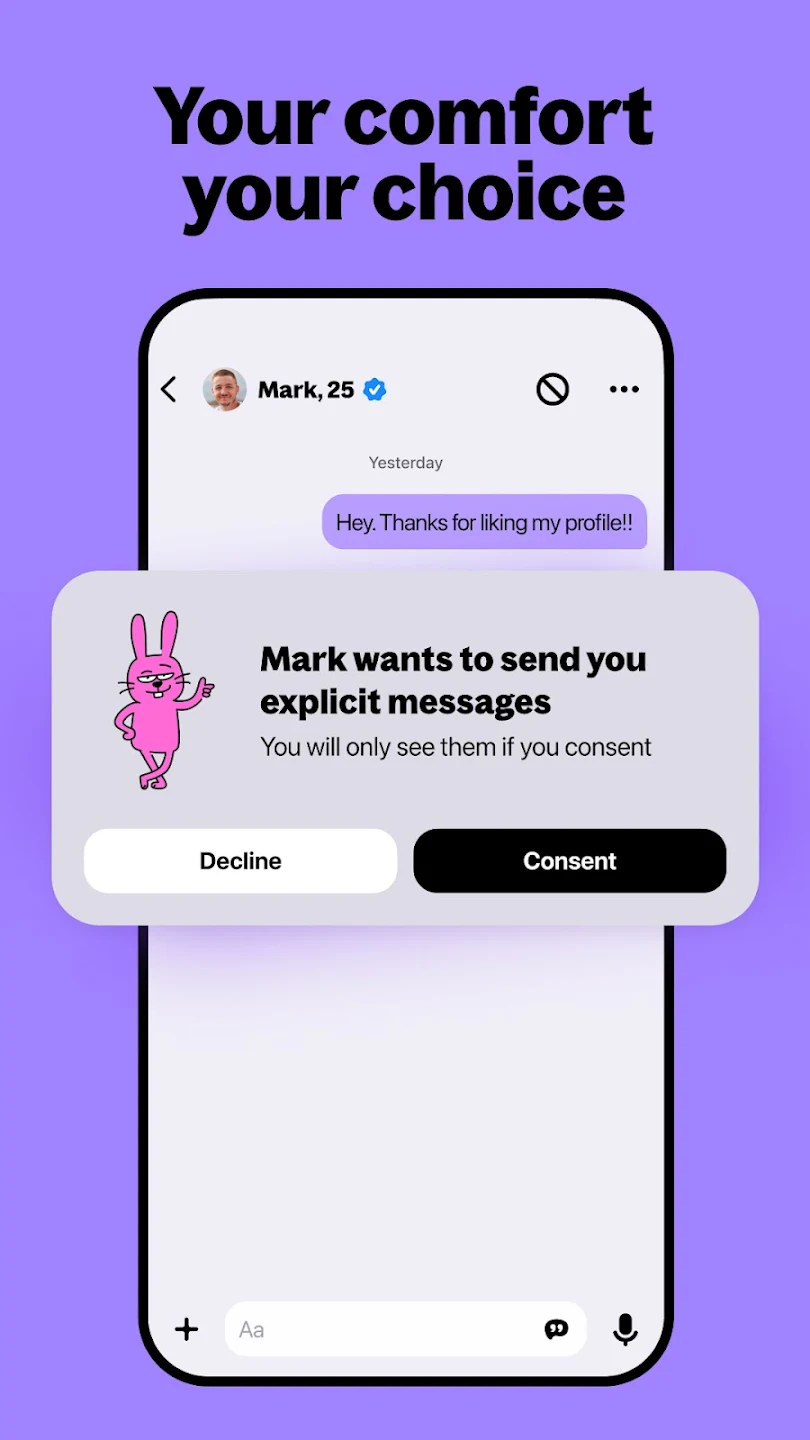
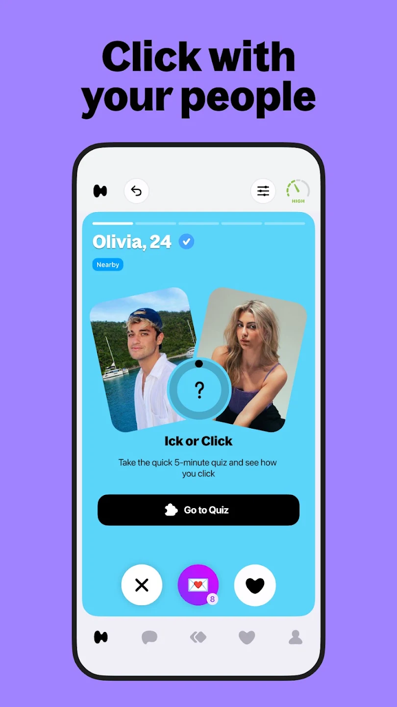
3. The first three screenshots do most of the work
In search results, people see only your first few screenshots, and most decide without scrolling. Treat them as a sequence: the main benefit first, then the proof, then the feature that makes you different.
Big captions, one idea per frame, and real app screens underneath. If a caption needs to be read twice, it's too long.
4. Video works differently in each store
App Store previews autoplay without sound in the listing, so the first seconds must make sense muted. On Google Play, you add a YouTube promo video, and the feature graphic becomes its cover image. Design Apple's preview for sound off with real in-app footage, and use Google's video for the fuller story.
5. Google Play needs a feature graphic
Google Play requires a 1024 by 500 feature graphic to publish your listing. It appears at the top of the page and in featured placements. Apple has no equivalent. Design it as a banner, with your promise in a few words and the app visible, not as a stretched screenshot.
6. Both stores let you test, so use it
Apple offers Product Page Optimization and Google offers store listing experiments. Both let you show different screenshots or icons to part of your traffic and compare installs.
Test one big change at a time, like the first screenshot or the icon, and let it run long enough to reach a clear result. Small wording tweaks rarely move the number.
The short version
- Write the Google Play description for search. Write the App Store description to persuade.
- Put App Store search terms in the keyword field, not the description.
- Make the first three screenshots tell the whole story.
- Design the App Store preview for sound off.
- Give Google Play a real feature graphic.
- Test one big change at a time in each store.