App Store Conversion Rate Optimization: 5 Reasons Your Store Page Is Under 20%
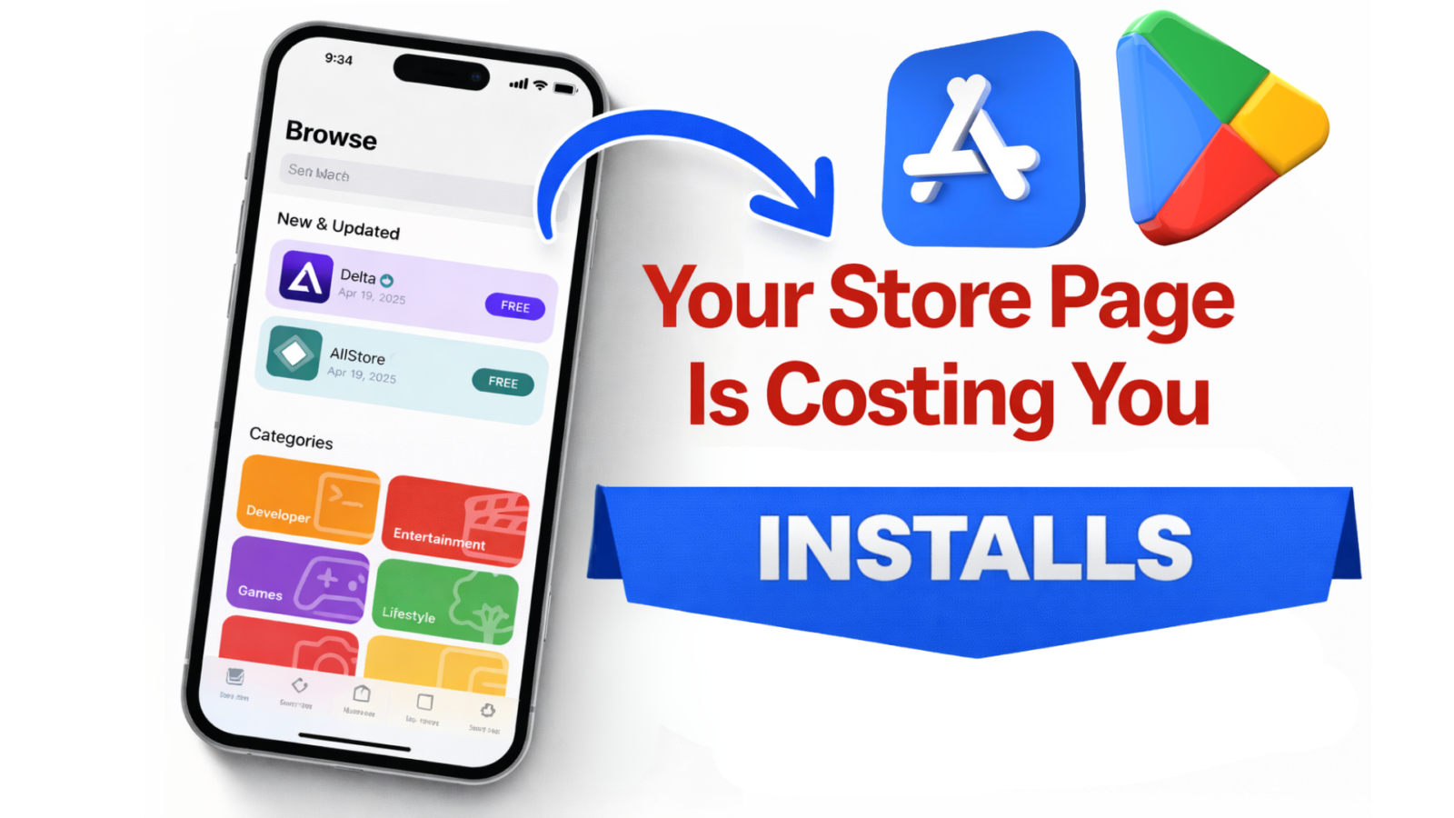
Top 5 Reasons Your Store Page Converts Under 20% (Even With a Great Product)
If your store page is under 20% conversion…
It’s rarely because your app is “not good enough.”
It’s usually because your page makes the product feel risky.
And risk always beats interest.
Traffic doesn’t fix confusion.
It amplifies it.
✅ Quick context: average conversion rates vary a lot by category, but many apps can climb above 20% once the page removes uncertainty and matches intent.

If you’re under 20%, you don’t have a traffic problem
Most founders react the same way:
- “We need more installs.”
- “We need better creatives.”
- “We need more spend.”
But when conversion is stuck under 20%, the real issue is usually decision friction.
Your store page isn’t “informing.”
It’s forcing the user to guess.
And when users guess, they bounce.
The hidden mechanism: users aren’t comparing features, they’re pricing risk
This is the part most people miss.
Users don’t open your store page to learn what your app can do.
They open it to answer one question:
🧠 “Is this worth my time (and will I regret it)?”
Your page needs to reduce 3 fears fast:
✅ Time waste (“I’ll install it and it won’t work for me”)
✅ Effort waste (“setup looks annoying”)
✅ Money trap (“paywall / upsell / hidden cost”)
If your page doesn’t address those fears quickly…
Your CVR will stay capped.
60-second Store Page Audit (fast self-test)
Open your store page and score it honestly.
✅ The 7-Point Store Page Clarity Scorecard (0–7)
Give yourself 1 point for each “yes”:
- ✅ First screenshot clearly shows the outcome (not the UI)
- ✅ The user understands who it’s for in 3 seconds
- ✅ There’s proof of results (numbers, outcomes, credibility)
- ✅ The “how it works” is obvious without reading paragraphs
- ✅ The page makes pricing feel safe (no surprise paywall feeling)
- ✅ Screenshots follow a logical story (not a gallery)
- ✅ Your page matches your traffic source promise (ad → page)
0–3 = your page is a risk machine
4–5 = you’re leaking installs
6–7 = now growth spend actually works
Reason #1, Your first screenshot answers the wrong question
Your first screenshot is not a “feature highlight.”
It’s a decision headline.
Most first screenshots say:
- “Track habits”
- “Manage tasks”
- “Monitor your budget”
That’s not a reason to install.
That’s a category label.
🔥 Your first screenshot must answer:
“What changes for me after I use this?”
✅ Before → After example (rewrite)
Before (feature):
“Smart habit tracking with reminders”
After (outcome):
“Build habits that stick in 7 days (with a plan you can follow)”
Before (feature):
“AI note-taking for meetings”
After (outcome):
“Turn calls into clean notes + action items in 10 seconds”
Before (feature):
“Personal finance dashboard”
After (outcome):
“Know where your money goes—without spreadsheets”
✅ Outcome first.
Mechanism second.
Reason #2, Your value prop is “true”… but not felt
This one is brutal.
Because your copy might be accurate.
But still low-converting.
Why?
Because accuracy doesn’t create clarity.
And clarity doesn’t create action unless it creates felt relevance.
Example:
“An all-in-one productivity app.”
True.
Also invisible.
It doesn’t land.
✅ The “Specificity Ladder” (what converts)
Level 1 (generic): “Boost productivity”
Level 2 (category): “Task manager for teams”
Level 3 (job-to-do): “Turn chaos into a daily plan”
Level 4 (moment): “Know what to do next in 5 seconds” ✅
The closer you get to a real moment in the user’s day…
The higher your CVR goes.
Want a deeper ASO + positioning knowledge base?
Here’s a solid hub: app marketing expert tips, ASO guides & growth strategies
Reason #3, Your proof is invisible (or arrives too late)
Most store pages have “proof”.
But it’s placed like decoration.
Users don’t read your page top-to-bottom.
They scan.
They pattern-match.
They hunt for safety signals.
✅ Proof needs to show up early and visually, not as text buried below.
✅ Proof types that actually move installs
Use at least one of these:
✅ Outcome proof: “Save 2 hours/week”
✅ Credibility proof: “Featured by…” / “Used by…”
✅ Constraint proof: “No account required” / “Works offline” / “No ads”
✅ Friction proof: “Setup in 30 seconds”
✅ Risk reversal proof: “Cancel anytime” (if true)
If you don’t show proof early…
Your page feels like a promise.
Not a product.
Reason #4, Your page is attracting the wrong intent
This is the silent killer.
Your app may be great.
But your page may be attracting users who will never convert.
Example:
You sell an app for serious lifters.
Your page looks like a “general fitness tracker.”
So you get lots of installs.
And terrible retention.
This creates the illusion of growth while your LTV collapses.
✅ If you want this solved properly, your store page must filter, not just sell.
That’s why installs ≠ growth.
If you want to go deeper on that side (retention + revenue mechanics), this is relevant:
The Ultimate 2025 App Retention & Monetization Playbook
Reason #5, Your creatives are misaligned with your ads
If you run ads and your store CVR drops…
Your store page might not be “bad.”
It might be inconsistent.
Your ad creates a mental promise.
Your store page must continue that promise instantly.
If your ad says:
“Learn Spanish in 10 minutes/day”
But your store page shows:
- a dashboard
- flashcards
- grammar features
- generic screenshots
…the user feels the disconnect.
⚠️ They don’t say it out loud.
They just leave.
And your CPI “mysteriously” rises.
If you’re building your growth around short-form creatives, this ties in perfectly:
TikTok 2.0: how 3–6 second video ads are boosting app downloads
🔥 The Fix Plan (what to change first, second, third)
Don’t redesign everything.
That’s how founders burn months.
Do this in a tight order.
Step 1: Rewrite only Screenshot #1 (the decision frame)
Goal: outcome + who it’s for.
Not UI.
Not features.
Step 2: Reorder screenshots into a “belief sequence”
A simple structure that works across categories:
- Outcome (what changes)
- Proof (why trust it)
- How it works (simple mechanism)
- Objection handling (risk removal)
- Depth (features for the nerds)
Step 3: Add one “risk reducer” line
Examples:
- “No signup required”
- “Try it free, cancel anytime”
- “Works offline”
- “No ads. Ever.”
Only claim what’s true.
Users can smell fake safety.
Step 4: Run a real experiment (don’t guess)
Use native store testing tools:
- Apple: Product Page Optimization
- Google Play: Store Listing Experiments
Your first test should usually be:
✅ Screenshot #1 headline
✅ Screenshot order
✅ Preview video vs no video (for paid traffic)
Not “icon vs icon” unless your brand is already known.

⚠️ 3 traps that keep smart founders stuck under 20%
1) You “explain the app” instead of selling the outcome
Users don’t want an app.
They want the after.
2) You show the UI before you earn attention
UI without context looks like work.
3) You optimize for clicks, not conversions
High CTR with low CVR means you’re winning attention…
…and losing trust.
If you want a clean way to grow without burning budget, keep this in mind too:
Organic growth & ASO in 2025 (without spending a dime)
The takeaway (and the one thing to do this week)
If your store page is under 20%…
Your product may be strong.
Your page is just making users feel uncertain.
Fix the first screenshot.
Then fix the belief sequence.
Everything else becomes easier.
If you want, you can get in touch with us, and we will help you see exactly what’s blocking installs.
TikTok 2.0: How 3–6 Second Video.
Why You Can’t Afford to Ignore TikTok’s Swipe Mode Revolution TikTok’s latest evolution, Swipe Mode +.
Why Some Apps Rank on App.
Ranking on app store top 100 isn’t a reward for having a great app. It’s a.